You're staring at a nearly finished interface the night before launch. The colors are consistent, the cards align, the AI result looks convincing, and the prototype feels close enough to ship. Then two early users try the flow. Both reach the results page, hesitate, and miss the upgrade action. One can't tell whether a backlink is nofollow or dofollow. The other submits an incomplete form because the prototype never showed what happens when the AI fails.
The problem isn't that the prototype looks too good. The problem is that it only looks good.
A high fidelity prototype should help you answer a specific product question before you spend engineering time. That may require realistic visuals, but it may also require believable content, clickable state changes, simulated latency, or an honest failure response. Treating fidelity as one slider from rough to polished makes it easy to perfect the wrong thing.
This guide uses four separate dials, visual, interaction, content, and technical fidelity, so you can decide what needs to be real and what can safely remain simulated.
The Moment a Beautiful Prototype Stops Helping You
The founder at the desk has a familiar dilemma. The prototype has taken days to polish, so changing the layout feels expensive. Yet the most important launch question remains unanswered: can a new user understand the path from discovering the product to completing the core action?
A polished screen can hide missing workflow logic. A button may look clickable but lead nowhere. A dashboard may display realistic charts while ignoring empty states, failed requests, delayed responses, or permission problems. Users then react to the surface rather than the experience they'll actually receive.

Practical rule: A prototype is valuable only when it produces evidence for a decision you need to make.
For an AI product, the gap becomes wider. The interface can promise instant answers while the model takes time to respond. It can show a confident recommendation without revealing uncertainty. It can make a refusal look like a technical bug, or make a generated result appear more reliable than it is.
That's why the rest of this article separates fidelity into four dimensions:
- Visual fidelity: whether the interface looks and feels like the intended product.
- Interaction fidelity: whether clicks, typing, navigation, states, and transitions behave realistically.
- Content fidelity: whether the words, examples, labels, and generated outputs resemble real use.
- Technical fidelity: whether latency, permissions, data variability, errors, and model behavior are represented accurately.
You might turn visual fidelity high while keeping technical fidelity deliberately simulated. You might use realistic error copy but leave animations out. You might build one launch flow in detail and leave secondary settings as static screens.
The central question is simple: which parts of this prototype must be real for the test to be trustworthy?
What a High Fidelity Prototype Actually Is
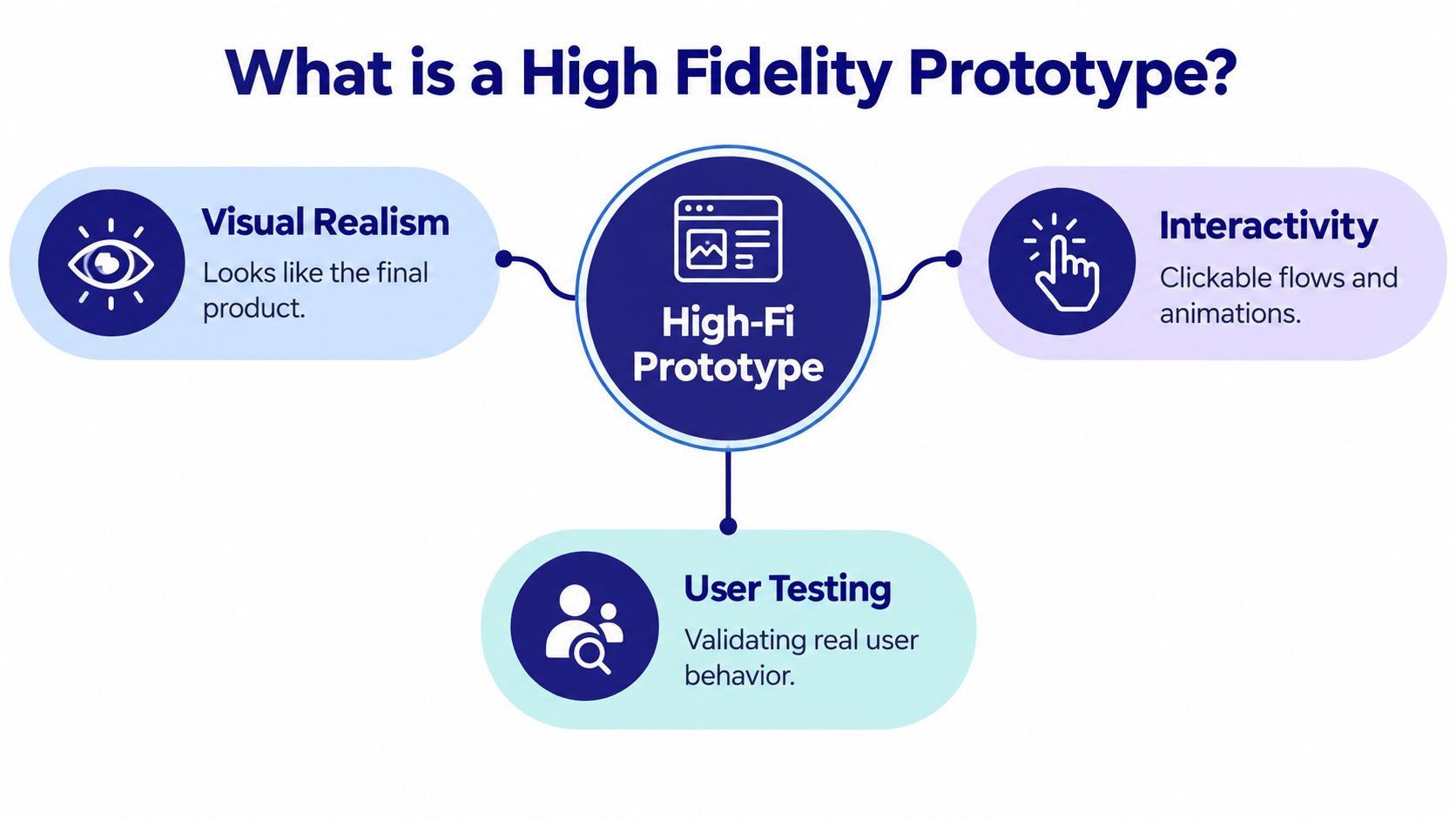
A high fidelity prototype is a product simulation detailed enough for people to perform realistic tasks and for a team to observe meaningful behavior. It usually resembles the intended product in appearance, content, and interaction, but resemblance alone isn't a sufficient definition.
Researchers often describe fidelity through three lenses. Physical fidelity covers appearance and sensory properties, such as typography, spacing, color, imagery, and responsive presentation. For an AI dashboard, it includes whether the interface feels like the intended desktop or mobile environment.
Functional fidelity covers what happens when someone interacts with the prototype. A search field should accept input. Filters should change the visible results. A submit button should show validation, progress, success, or failure. If the prototype only presents attractive static frames, it has low functional fidelity even when its visual design is excellent.
Contextual fidelity covers how closely the testing situation matches real use. A founder testing an AI tool in a quiet design review is not reproducing the same conditions as a user arriving from a launch page, scanning unfamiliar terminology, working with incomplete information, and waiting for a result.
Four dials instead of one
The four-dial model makes the definition practical:
| Dimension | What it simulates | Best for testing |
|---|---|---|
| Visual | Layout, typography, color, hierarchy, responsive presentation | Trust, comprehension, visual priority, and credibility |
| Interaction | Clicks, typing, navigation, validation, states, and transitions | Workflow completion and discoverability |
| Content | Labels, instructions, examples, AI outputs, and error messages | Meaning, comprehension, and user expectations |
| Technical | Latency, permissions, data variation, refusals, failures, and system feedback | Operational realism and confidence in AI behavior |
A prototype can be high fidelity in one dimension and intentionally low fidelity in another. Scripted AI responses can support workflow testing if the script reflects realistic outcomes and the test measures whether users understand the process. A static analytics chart may be enough for a visual hierarchy review, but not for testing whether users can interpret changing performance feedback.
A useful working definition is this: a high fidelity prototype is a targeted experimental instrument, not a miniature finished product. Its quality depends on whether it represents the behaviors relevant to the decision. Before designing, write down what the prototype must prove, what it will simulate, and what it cannot represent.
Low Fidelity vs High Fidelity Prototypes and When to Use Each
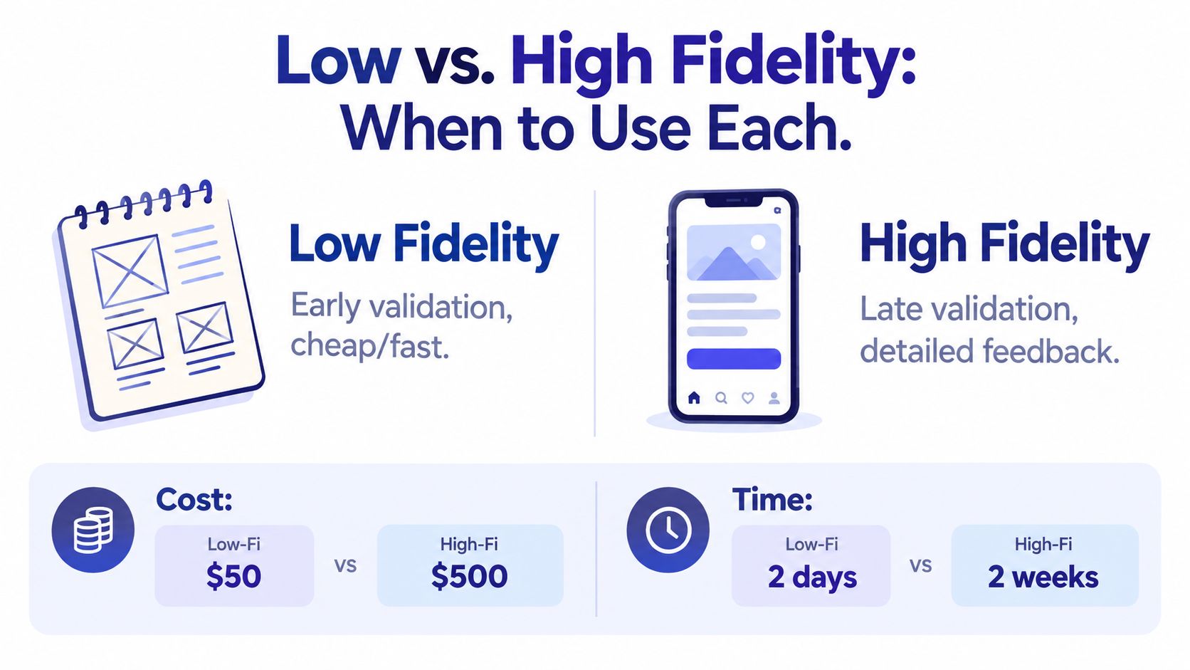
Low fidelity and high fidelity prototypes aren't ranks in a design hierarchy. They answer different questions.
A rough sketch is useful when you're deciding whether the main flow should have three steps or five. A detailed prototype is useful when you're testing whether people understand a form, notice an important action, or recover from an error. The right choice depends on the decision in front of you, not on how close the calendar is to launch.
Match the prototype to the decision
| Decision | More suitable starting point | Why |
|---|---|---|
| Choose the core product flow | Low fidelity | Rough screens keep attention on structure and sequence |
| Validate the value proposition | Low or mixed fidelity | Users can react to the promise without being distracted by styling |
| Sanity-check pricing | Mixed or high fidelity | Realistic plan names, benefits, and comparison language affect comprehension |
| Explain nofollow versus dofollow outcomes | High content fidelity | The wording and explanation carry the meaning |
| Rehearse the launch submission | High interaction and content fidelity | Validation, progress, success, and failure states must feel credible |
A common founder mistake is polishing the first plausible idea before anyone has challenged the flow. A grayscale wireframe can reveal that users don't know where to begin. It can also expose unnecessary steps while the team still feels comfortable discarding them.
High fidelity becomes worthwhile when the details influence the answer. If you're testing whether a Premium plan's benefits are understandable, use realistic copy and a believable comparison. If you're testing whether a launch form recovers from an invalid project URL, simulate the error and the path back to success. Pixel-perfect icons won't answer either question.
AI tools need an extra safeguard. A polished interface can suggest that the underlying model is stable, fast, and precise even when none of those assumptions has been tested. Keep the interface realistic enough to establish context, but spend fidelity effort on the behavior that could change user trust.
Don't ask whether the prototype is high fidelity overall. Ask which dial is high enough for this test.
A one-person team may need a low-fidelity flow for navigation, a high-content screen for pricing, and a technically simulated AI response for the launch demo. That mixed approach is often faster and more honest than building every screen as though engineering has already begun.
Why Higher Fidelity Does Not Always Mean Better Insights
A more realistic prototype can improve a test, but it can also introduce noise. In a controlled study of 60 participants completing mobile-phone tasks, researchers compared paper, computer, and fully operational prototypes. The study found that task-completion times in the computer prototype could be overestimated, and that visual attractiveness affected aesthetic judgments and emotions. The study abstract provides the relevant research context.
That finding matters because users don't interact with visual polish neutrally. A beautiful interface may encourage exploration, create confidence, or make participants comment on colors and spacing instead of explaining why they couldn't complete the task. A prototype can therefore feel more realistic while producing less focused evidence.
Separate usability research has found low- and high-fidelity prototypes equally effective at uncovering usability problems, while an 80-participant study found no major overall differences in outcomes attributable to perceived prototype fidelity. The research discussion supports a more careful conclusion: fidelity helps when it matches the research question.
Spend realism where it changes behavior
High fidelity earns its cost when the test depends on:
- Hierarchy: Can users identify the primary action among competing controls?
- Comprehension: Do people understand a feature, label, pricing plan, or AI result?
- State transitions: Do users know what happened after submitting, filtering, saving, or retrying?
- Credibility: Does the interface communicate the right level of confidence?
- Responsive behavior: Does the experience remain understandable across the intended viewport or input method?
For an AI launch tool, realistic copy and failure states may matter more than decorative detail. A believable loading state can reveal whether users understand that the system is working. A refusal message can show whether people know what they can try next. Variable results can expose whether the interface communicates uncertainty responsibly.
Use visual polish as support, not proof. A participant liking the interface doesn't demonstrate that they can find the upgrade path. A short interaction doesn't necessarily indicate ease if the prototype skipped validation. Record completion, errors, abandonment, and comprehension separately from aesthetic preference.
How Figr Can Help
Founders often lose time rebuilding context before they can prototype a new flow. Existing screens, design tokens, product rules, analytics, and edge cases sit in different places, so the prototype starts as a generic approximation rather than a continuation of the product.
Figr is an AI design agent built to ground product work in real product context. It can capture a live app through a Chrome workflow, import Figma systems and tokens, and retain decisions across sessions. From that context, teams can generate PRDs, user flows, edge cases, test cases, UX reviews, and high-fidelity prototypes that reflect the existing product instead of a generic template.
The useful distinction is between generating screens and improving the decision behind them. Figr can help map a complex flow, suggest edge cases before handoff, check accessibility, enforce design tokens, and export work to Figma. It also connects analytics to funnel analysis, which can help a team compare observed drop-offs with the interaction it intends to test.
Its High fidelity prototype workflow makes sense when you already have product context and need to explore variations without losing consistency. It's less useful if your core proposition is still unsettled and a rough sketch would encourage more honest changes.
The practical benefit is not that every output should go directly to engineering. You still need to inspect the content, verify simulated states, and test the flow with users. Figr is a strong fit when the main bottleneck is translating existing product knowledge into coherent, testable artifacts.
An End to End Workflow for Building a High Fidelity Prototype
A useful build process starts with the decision, not the canvas. The five phases below keep the prototype narrow enough to finish and realistic enough to test.
Decide
Write a one-page fidelity specification before opening your design tool. For every screen or state, mark the four dials as low, medium, or high.
Decide which screens need accurate visual hierarchy. Identify the interactions that must be clickable, the copy that must use real language, and the technical behavior that needs simulation. For an AI launch flow, that may mean high visual fidelity on the project page, high interaction fidelity for filtering and submission, high content fidelity for pricing and link attributes, and simulated technical fidelity for analytics processing.
Script
Create the experience that users will encounter. Replace placeholder copy with realistic project names, descriptions, validation messages, plan details, and AI responses.
Include at least one realistic failure. The AI may refuse a request, return an uncertain result, exceed a time threshold, or receive incomplete input. Write what the user sees and what action they can take next. A prototype that only demonstrates success teaches the team very little about launch readiness.
Build
Build the shortest connected path from entry to outcome. Use the design tool your team already understands, and avoid creating a component system solely for this prototype unless consistency is part of the test.
A solo founder might create the core journey in a design workspace with linked screens and scripted states. A team with an existing system can reuse components and spend the saved time on realistic content and error handling. For an early launch workflow, a focused project such as the EarlyHunt MVP builder can help frame what belongs in the first usable version.
Test
Run the prototype with realistic tasks, not a guided tour. Ask users to submit a project, find the appropriate launch option, interpret the link outcome, and recover from a problem without telling them where to click.
Observe behavior before explaining anything. Record whether people complete the task, where they pause, which labels they misread, and what they expect to happen next. Keep visual preference separate from workflow evidence.
Ship
Hand engineering and stakeholders a short written brief. State what is real, what is scripted, what is intentionally omitted, and which findings changed the design.
| Phase | Output | Unblocks |
|---|---|---|
| Decide | Fidelity specification | Scope and test purpose |
| Script | Realistic copy and states | Comprehension and failure testing |
| Build | Connected clickable flow | Task-based evaluation |
| Test | Observation notes and findings | Design decisions |
| Ship | Handoff brief | Implementation alignment |
The handoff note prevents a common misunderstanding. Engineers shouldn't assume that a simulated AI response represents a production guarantee, and stakeholders shouldn't treat a polished screen as evidence that the workflow has been validated.
Tools Worth Using and Tools You Can Skip
Choose tools by the behavior they help you test. A small AI team doesn't need a large stack if the prototype has a narrow launch goal.
Visual design and UI systems
Figma works well for screens, reusable components, layout, and shared review. If your product already has a design system, use its tokens and components where possible. Consistency matters when you're testing hierarchy or credibility.
Figr can help when the team needs AI-assisted exploration grounded in an existing product. It's especially relevant when you need to generate connected artifacts rather than isolated screens.
Clickable interaction
Use Figma's prototype mode for straightforward navigation, overlays, and common states. ProtoPie is useful when the test depends on richer interactions, gestures, variables, or animated responses.
Don't add an interaction tool because it sounds advanced. Add it when your current tool cannot represent the behavior that determines the decision.
Content and microcopy simulation
A shared document, spreadsheet, or design-library page can be enough for realistic content planning. Draft the exact labels, empty states, error messages, AI responses, and permission notices before placing them in the interface.
This category is often overlooked. In AI products, content is part of the behavior. A generated explanation, refusal, or uncertainty message can change whether users trust the result.
End-to-end flow validation
For early validation, use a clickable prototype, a lightweight screen recorder, or a simple product testing workflow. EarlyHunt also maintains a directory of prototyping, user-testing, and design-collaboration tools, which can help you compare options without assembling a complicated stack. Explore EarlyHunt's tools directory when you need to find a category-specific option.
Skip full-coded staging builds when the question is still about flow or comprehension. Skip complex component libraries if you're testing one launch path. Skip dedicated usability lab software unless your research requirements genuinely demand it.
Tool rule: Start with the tool you already know. Upgrade only when you hit a specific ceiling.
A founder who needs to test whether users can submit a launch may need one design tool, realistic copy, and a way to observe sessions. More software won't compensate for an unclear task or an untested failure state.
Testing the Prototype Before You Spend Engineering Time
A defensible prototype test doesn't need a lab. It needs a clear task, consistent observation, and enough participants to reveal recurring confusion. For a small launch team, plan for five to seven participants, with two to three realistic tasks per participant, one observer, and one dedicated notetaker.
Each task should have a defined success condition. “Explore the product” is too vague. “Choose the launch option that matches your backlink requirement and explain what happens to the link” gives you something observable.
Track more than completion. Note the time to complete, errors, hesitation, requests for help, and the participant's explanation of what happened. If someone completes the task only after you point at the right control, record that as assisted completion rather than success.
A compact testing protocol
- Prepare the scenario: Give participants a realistic reason to use the tool, such as preparing an AI product for launch.
- Use task language: Ask what they would do, not whether they like the screen.
- Stay quiet: Let participants reveal navigation problems without rescuing them immediately.
- Record errors: Note missed controls, misunderstood labels, invalid submissions, and abandoned paths.
- Probe comprehension: Ask participants to explain what an AI result, plan benefit, or link attribute means.
- Separate reactions: Capture aesthetic comments separately from workflow breakdowns.
- Debrief expectations: Ask what they thought would happen, what surprised them, and what they'd change.
- Document uncertainty: Mark which findings came from real behavior and which came from prototype limitations.
An aesthetic complaint sounds like, “The color feels too dark.” A workflow problem sounds like, “I didn't know whether my project had been submitted.” The first may matter later. The second can block launch.
Accessibility needs to be part of the prototype test, not a final implementation check. A 2025 accessibility-focused paper reports that 55% of GUI controls in prototyping tools had accessibility issues for screen-reader users, while also noting that tester support didn't fully extend to designers. The accessibility research explains why visual inspection alone can't establish access.
Before stakeholder signoff, test keyboard-only navigation, focus order, screen-reader landmarks, zoom-friendly layouts, form errors, modal dialogs, loading states, and meaningful announcements. For AI tools, check whether generated content, uncertainty, refusals, and changing results are presented in a way that assistive technology can interpret.
If you need to turn a documented flow into a repeatable walkthrough, EarlyHunt's interactive user journey flow recorder is one possible lightweight aid. The tool should support observation, not replace it.
Launch Week Pre Flight and the Real Job of a Prototype
Before launch, tape this checklist beside your desk:
- Define the decision: Write the one question the prototype must answer.
- Set four fidelity dials: Choose visual, interaction, content, and technical realism independently.
- Use real language: Replace placeholder copy with the words users will read.
- Simulate failure: Include delay, invalid input, empty results, refusal, or recovery where relevant.
- Run realistic tasks: Test the flow without narrating the correct path.
- Observe accessibility: Check keyboard movement, focus, zoom, screen-reader structure, and state announcements.
- Record what's simulated: Tell engineering exactly which responses, data, and timings are scripted.
- Separate evidence: Keep task completion and comprehension apart from aesthetic preference.
A prototype's job isn't to look finished. Its job is to reduce uncertainty before the team commits to building, promoting, or supporting the product. Sometimes a rough wireframe does that better than a polished interface. Sometimes the decision depends on realistic copy, state transitions, or credible AI behavior, so a high fidelity prototype is the responsible choice.
Launch week exposes the difference between a screen that demonstrates an idea and a workflow that supports a person. Users may arrive with incomplete inputs, misread a benefit, question a generated result, or encounter a refusal. Your prototype should represent those moments when they affect the decision you're making.
As the AI product matures, prototype model behavior as deliberately as interface behavior. Test changing outputs, uncertainty, permissions, latency, refusals, and recovery paths. The most useful prototype is the one that shows your team what it still doesn't know.
Choose one launch-critical workflow today, write its four fidelity decisions on a single page, and build only the states needed to test them. Then put the prototype in front of real users before you spend engineering time on polish that may be hiding the actual problem.